Short Answer
Welcome to a fascinating exploration of tarot cards and their typographic counterparts. In this guide, you’ll uncover the intriguing parallels between traditional tarot imagery and the art of typography. Discover how symbols, structure, and meaning intertwine in both disciplines, revealing a hidden language that speaks to the soul. Whether you’re a tarot enthusiast, a designer, or simply curious, this journey will illuminate the unique appeal of these visual and symbolic systems.
The Language of Symbols: Tarot and Typography
At first glance, tarot cards and typography seem worlds apart—one dives into mysticism and divination, while the other shapes written communication. Yet, both rely on symbols to convey meaning. Tarot cards use archetypal imagery—The Fool’s journey, the Empress’s abundance, the Tower’s chaos—to tell stories and offer insights. Typography, on the other hand, uses letterforms and fonts to evoke emotions, set tones, and communicate ideas visually.
Consider how the bold, commanding presence of a serif font might mirror the authority of The Emperor card, while the fluid, organic strokes of a script font could evoke the mystery of The High Priestess. Both tarot and typography are silent yet powerful communicators, using visual cues to shape perception and understanding.
The Structure of Meaning: Cards and Characters
Tarot decks are meticulously structured, with 78 cards divided into the Major Arcana (22 cards representing life’s grand themes) and the Minor Arcana (56 cards reflecting everyday experiences). Similarly, typography operates within a structured system—fonts are categorized into families (serif, sans-serif, script, monospace), each serving distinct purposes. The Major Arcana’s journey from The Fool to The World parallels the evolution of a typeface from its earliest iterations to modern refinements.
Just as each tarot card holds a specific meaning, each font carries its own personality. A gothic blackletter font might evoke the solemnity of The Hierophant, while a playful, rounded sans-serif could embody The Sun’s joy. The interplay between structure and symbolism in both systems creates a rich tapestry of expression.
Visual Storytelling: Imagery and Letterforms
Tarot cards are miniature works of art, blending illustration, color, and symbolism to tell a story at a glance. Typography, too, is an art form—letterforms are designed to be both functional and evocative. The curves of a ‘S’ in a logo might mirror the flowing robes of The Star, while the sharp angles of a ‘Z’ could reflect the chaos of The Tower.
Imagine a tarot deck where each card’s illustration is replaced by a custom typographic design. The Magician’s wand could be rendered as a bold, dynamic letter ‘I,’ while The Lovers’ intertwined figures might take the shape of an ampersand (&). This fusion of tarot and typography creates a visual language that is both ancient and contemporary, bridging centuries of artistic tradition.
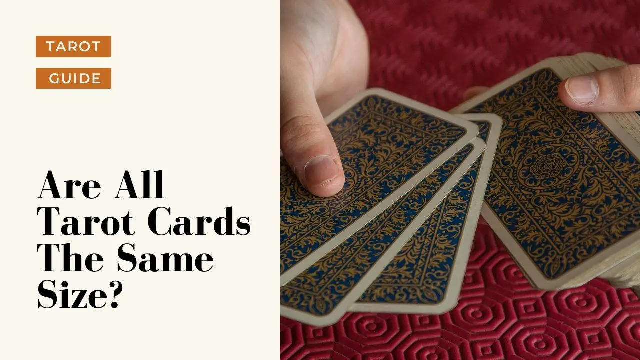
Above, a diverse array of tarot cards demonstrates the variety of sizes and artistic styles within a single deck. Similarly, typography embraces a spectrum of sizes and forms, from the delicate serifs of a book font to the bold, blocky letters of a headline typeface.
The Ritual of Selection: Choosing Cards and Fonts
Drawing a tarot card is an act of intention—a moment of reflection where the subconscious speaks through symbols. Selecting a font is no different; it’s a deliberate choice that shapes how a message is received. Both processes involve intuition and analysis. A designer might flip through fonts the way a tarot reader shuffles a deck, searching for the one that resonates with the project’s essence.
In typography, the wrong font can disrupt a design, just as the wrong tarot card can mislead a reading. The perfect match, however, elevates the message. A wedding invitation might call for an elegant script font, much like The Two of Cups symbolizes love and partnership. Meanwhile, a tech startup’s branding might embrace a clean, modern sans-serif, akin to The Six of Pentacles’ themes of balance and exchange.
Cultural Echoes: Tarot and Typography Across Time
Tarot’s origins trace back to 15th-century Italy, where it began as a card game before evolving into a tool for divination and self-reflection. Typography, too, has a storied history, from the Gutenberg Bible’s movable type to the digital fonts of today. Both have been shaped by cultural shifts, adapting to the needs and aesthetics of their eras.
In the 19th century, tarot experienced a revival during the occult revival, with decks like the Rider-Waite-Smith becoming iconic. Similarly, the Arts and Crafts movement redefined typography, emphasizing handcrafted letterforms. Today, modern tarot decks experiment with minimalist designs, while typography embraces variable fonts that adapt to any context. The parallels are undeniable—both are living art forms that evolve with the times.

This grid of typographic cards showcases the diversity and creativity of letterform design. Each card, like a tarot card, tells a story through its visual language, demonstrating how typography can be as expressive and symbolic as any tarot imagery.
Creating Your Own Tarot Typography
Why not merge these two worlds? Designing a tarot deck where each card’s symbolism is expressed through typography is a thrilling creative challenge. Start by selecting a font family and experimenting with how its characteristics align with tarot archetypes. For example, a distressed, grunge font could embody The Devil’s shadowy allure, while a geometric sans-serif might represent The Star’s clarity.
Alternatively, create a set of “typographic tarot” cards where letters and symbols combine to form new meanings. The letter ‘A’ could morph into a tower, the ‘O’ into a moon, and the ‘X’ into a crossroads. This fusion not only pays homage to both traditions but also creates a fresh, contemporary form of expression.
Conclusion
Tarot cards and typography are more than just tools—they are languages of the soul. Tarot speaks in symbols and archetypes, guiding us through life’s mysteries, while typography communicates through form and function, shaping how we perceive the written word. When these two disciplines intersect, they create a synergy that is both visually stunning and deeply meaningful.
Whether you’re drawn to the mysticism of tarot or the precision of typography, exploring their connections offers a richer understanding of both. Next time you shuffle a tarot deck or select a font, consider the parallels between the two. You might just find that the cards and the characters are speaking the same silent language all along.
FAQ
What are the main themes explored in the article?
The article explores the similarities between tarot cards and typography, focusing on symbolism, structure, and cultural significance.
How do tarot cards and typography communicate meaning?
Both use visual symbols to convey emotions and stories, with tarot relying on archetypes and typography on letterforms.
Leave a Reply